pacman::p_load(readxl, gifski, gapminder,
plotly, gganimate, tidyverse)Hands On Exercise 3
#Objectives - Create animated data visualisation by using gganimate and plotly r packages - Reshape data by using tidyr package - Process, wrangle and transform data by using dplyr package
Getting Started
Installing and loading the required libraries
The following R packages will be used:
plotly, R library for plotting interactive statistical graphs.
gganimate, an ggplot extension for creating animated statistical graphs.
gifski converts video frames to GIF animations using pngquant’s fancy features for efficient cross-frame palettes and temporal dithering. It produces animated GIFs that use thousands of colors per frame.
gapminder: An excerpt of the data available at Gapminder.org. We just want to use its country_colors scheme.
tidyverse, a family of modern R packages specially designed to support data science, analysis and communication task including creating static statistical graphs.
Importing the Data
The code chunk below imports GlobalPopulation.xlsx into R environment by using read_xls() function of readr package.
readr is a pacakge within tidyverse.
col <- c("Country", "Continent")
globalPop <- read_xls("data/GlobalPopulation.xls",
                      sheet="Data") %>%
  mutate_at(col, as.factor) %>%
  mutate(Year = as.integer(Year))
Animated Data Visualisation: gganimate methods
gganimate extends the grammar of graphics as implemented by ggplot2 to include the description of animation. A range of new grammar classes that can be added to the plot object for customisation:
transition_*()defines how the data should be spread out and how it relates to itself across time.view_*()defines how the positional scales should change along the animation.shadow_*()defines how data from other points in time should be presented in the given point in time.enter_*()/exit_*()defines how new data should appear and how old data should disappear during the course of the animation.ease_aes()defines how different aesthetics should be eased during transitions.
Building a static population bubble plot
In the code chunk below, the basic ggplot2 functions are used to create a static bubble plot.
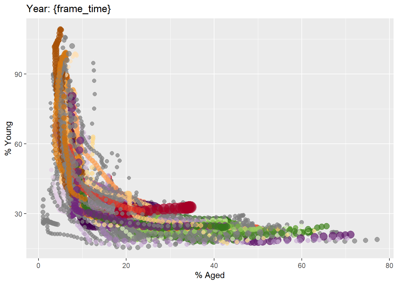
ggplot(globalPop, aes(x = Old, y = Young,
                      size = Population,
                      colour = Country)) +
  geom_point(alpha = 0.7,
             show.legend = FALSE) +
  scale_colour_manual(values = country_colors) +
  scale_size(range = c(2, 12)) +
  labs(title = 'Year: {frame_time}',
       x = '% Aged',
       y = '% Young')
Building the animated bubble plot
In the code chunk below,
transition_time()of gganimate is used to create transition through distinct states in time (i.e. Year).ease_aes()is used to control easing of aesthetics.The default is
linear.Other methods are: quadratic, cubic, quartic, quintic, sine, circular, exponential, elastic, back, and bounce.
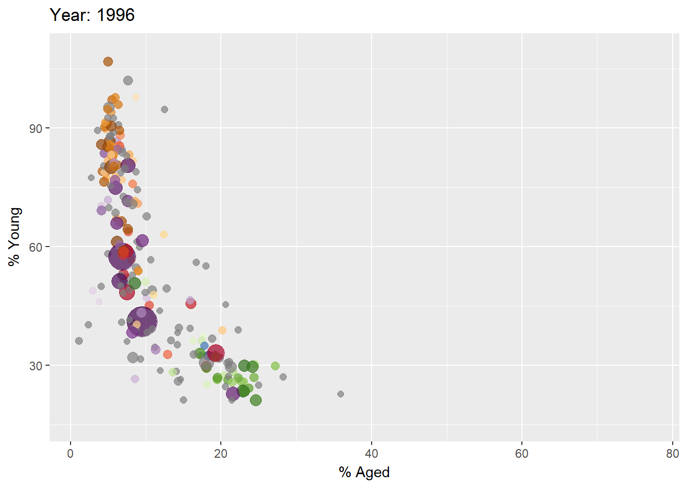
ggplot(globalPop, aes(x = Old, y = Young,
                      size = Population,
                      colour = Country)) +
  geom_point(alpha = 0.7,
             show.legend = FALSE) +
  scale_colour_manual(values = country_colors) +
  scale_size(range = c(2, 12)) +
  labs(title = 'Year: {frame_time}',
       x = '% Aged',
       y = '% Young') +
  transition_time(Year) +
  ease_aes('linear')
Animated Data Visualisation: plotly
In Plotly R package, both ggplotly() and plot_ly() support key frame animations through the frame argument/aesthetic. They also support an ids argument/aesthetic to ensure smooth transitions between objects with the same id (which helps facilitate object constancy).
Building an animated bubble plot: ggplotly() method
Create an animated bubble plot by using ggplotly() method.
Appropriate ggplot2 functions are used to create a static bubble plot. The output is then saved as an R object called gg.
ggplotly()is then used to convert the R graphic object into an animated svg object.
Although show.legend = FALSE argument was used, the legend still appears on the plot. To overcome this problem, theme(legend.position='none') should be used
gg <- ggplot(globalPop,
       aes(x = Old,
           y = Young,
           size = Population,
           colour = Country)) +
  geom_point(aes(size = Population,
                 frame = Year),
             alpha = 0.7) +
  scale_colour_manual(values = country_colors) +
  scale_size(range = c(2, 12)) +
  labs(x = '% Aged',
       y = '% Young') +
  theme(legend.position='none')

ggplotly(gg)
Building an animated bubble plot: plot_ly() method
Create an animated bubble plot by using plot_ly() method.
bp <- globalPop %>%
  plot_ly(x = ~Old,
          y = ~Young,
          size = ~Population,
          color = ~Continent,
          sizes = c(2, 100),
          frame = ~Year,
          text = ~Country,
          hoverinfo = "text",
          type = 'scatter',
          mode = 'markers'
          ) %>%
  layout(showlegend = FALSE)
bp