pacman::p_load(tidyverse, ggdist, ggthemes, colorspace, ggridges)
exam_df <- read_csv("data/Exam_data.csv")
exam <- exam_dfIn-class_Ex02 Demo
Load packages inside, import Exam_data.csv
Visualising Distribution with Histogram
Inherent problem with histogram, need to bin data and calculate frequency into the plot.
Use of rgb color picker to identify the color code.
"#xxxxx"Adjust: Used to set the distribution of the plot
Alpha: Used to set the transparency of the color.
ggplot(exam_df, aes (x = ENGLISH)) + geom_density(
  color = "#1696d2",
  adjust = 0.65,
  alpha = 0.6
)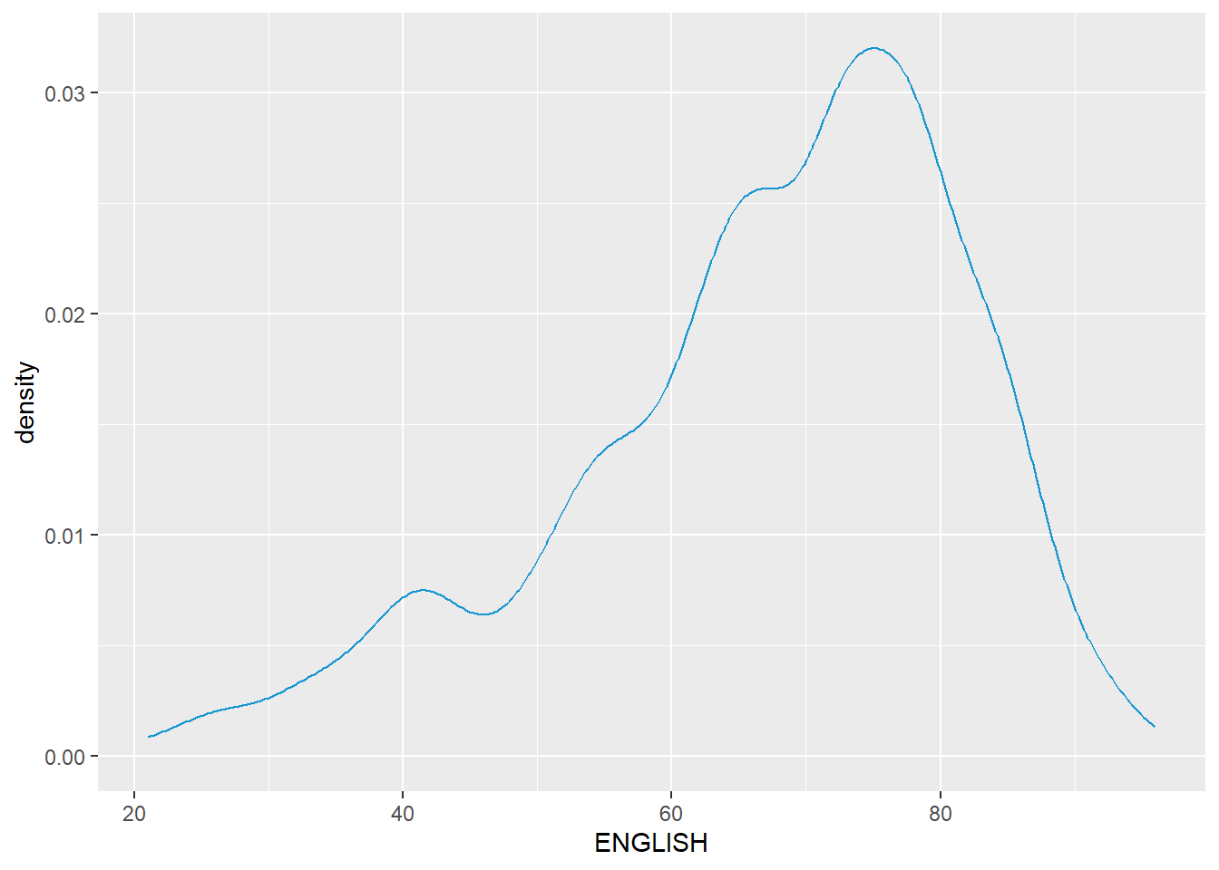
Using probability density plot (KDE - Kernel Density Estimation)
Giving shape of distribution (Using a continuous range) to overcome the issue of forced bins for histogram. –> Consider the underlying dataset nature whether it is continuous or discrete
The alternative design - Overlaying another distribution
# Including reference line (mean, median, standard deviation)
median_eng <- median(exam_df$ENGLISH)
mean_eng <- mean(exam_df$ENGLISH)
std_eng <- sd(exam_df$ENGLISH)

# Plotting density plot based on existing data set
# Including a theoretical model (norm distribution, with preset mean and sd)
ggplot(exam_df, aes(x= ENGLISH)) +
  geom_density(
    color = "#1686d2",
    adjust = 0.65,
    alpha = 0.6) +

  stat_function(
  fun = dnorm,
  args = list(mean = mean_eng, sd = std_eng),
  col = "grey30",
  linewidth = 0.8) +

  geom_vline(
  aes(xintercept = mean_eng),
  color = "#4d5887",
  linewidth = 0.6,
  linetype = "dashed") +
  annotate(geom = "text",
           x = mean_eng - 8, #Include -8 to shift the word beside
           y = 0.04,
           label = paste0("Mean ENGLISH: ",
                          round((mean_eng), 2)),
           color = "#4d5887") +
  geom_vline(
    aes(xintercept = median_eng),
    color = "#7097BB",
  linewidth = 0.6,
  linetype = "dashed") +
  annotate(geom = "text",
           x = median_eng + 8, #Include -8 to shift the word beside
           y = 0.04,
           label = paste0("Median ENGLISH: ",
                          round((mean_eng), 2)))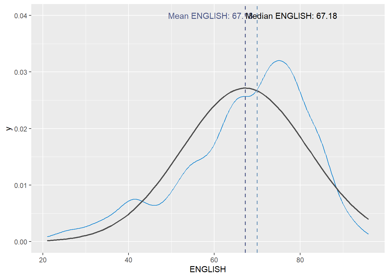
Visualising Distribution with Ridgeline Plot
Ridgeline plot (sometimes called Joyplot) is a data visualisation technique for revealing the distribution of a numeric value for several groups. Distribution can be represented using histograms or density plots, all aligned to the same horizontal scale and presented with a slight overlap.
Figure below is a ridgelines plot showing the distribution of English score by class.
Plotting ridgeline graph: ggridges method
There are several ways to plot ridgeline plot with R. In this section, you will learn how to plot ridgeline plot by using ggridges package.
ggridges package provides two main geom to plot gridgeline plots, they are: geom_ridgeline() and geom_density_ridges(). The former takes height values directly to draw the ridgelines, and the latter first estimates data densities and then draws those using ridgelines.
The ridgeline plot below is plotted by using geom_density_ridges().
ggplot(exam_df,
       aes(x = ENGLISH,
           y = CLASS)) +
  geom_density_ridges(
    scale = 3,
    rel_min_height = 0.01,
    bandwidth = 3.4,
    fill = lighten("#7097BB", .3),
    color = "white"
  ) +
  scale_x_continuous(
    name = "English grades",
    expand = c(0, 0)
    ) +
  scale_y_discrete(name = NULL, expand = expansion(add = c(0.2, 2.6))) +
  theme_ridges()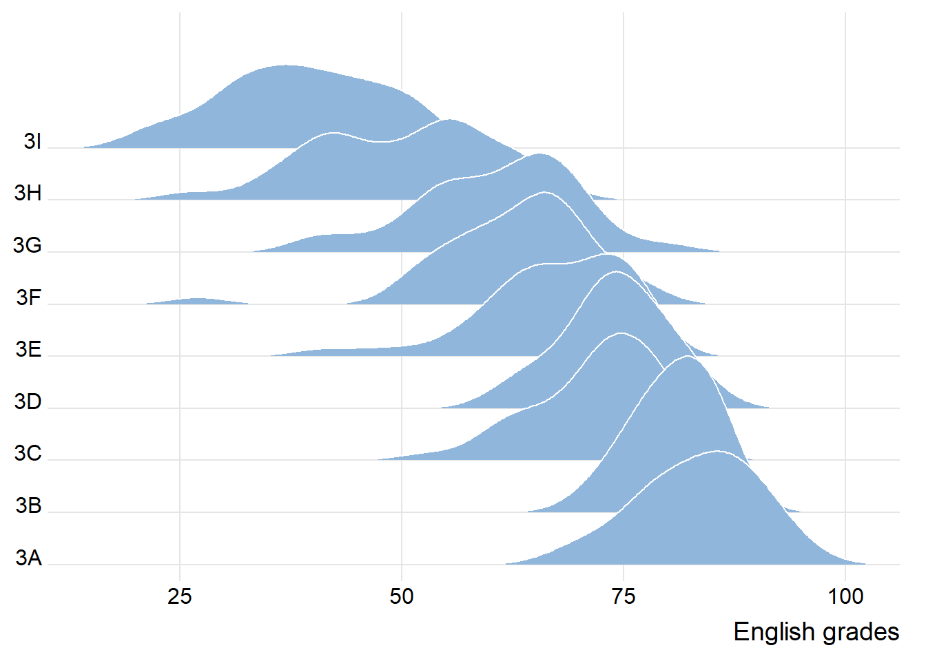
Varying fill colors along the x axis
Sometimes we would like to have the area under a ridgeline not filled with a single solid color but rather with colors that vary in some form along the x axis. This effect can be achieved by using either geom_ridgeline_gradient() or geom_density_ridges_gradient(). Both geoms work just like geom_ridgeline() and geom_density_ridges(), except that they allow for varying fill colors. However, they do not allow for alpha transparency in the fill. For technical reasons, we can have changing fill colors or transparency but not both.
ggplot(exam_df,
       aes(x = ENGLISH,
           y = CLASS,
           fill = after_stat(x))) +
  geom_density_ridges_gradient(
    scale = 3,
    rel_min_height = 0.01) +
  scale_fill_viridis_c(name = "Temp. [F]",
                       option = "C") +
  scale_x_continuous(
    name = "English grades",
    expand = c(0, 0)
  ) +
  scale_y_discrete(name = NULL, expand = expansion(add = c(0.2, 2.6))) +
  theme_ridges()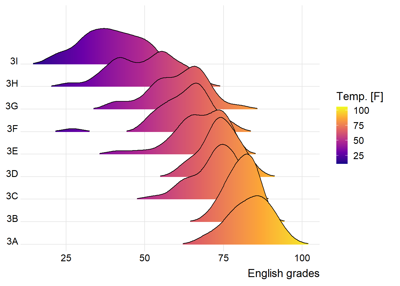
Mapping the probabilities directly onto colour
Beside providing additional geom objects to support the need to plot ridgeline plot, ggridges package also provides a stat function called stat_density_ridges() that replaces stat_density() of ggplot2.
Figure below is plotted by mapping the probabilities calculated by using stat(ecdf) which represent the empirical cumulative density function for the distribution of English score.
ggplot(exam_df,
       aes(x = ENGLISH,
           y = CLASS,
           fill = 0.5 - abs(0.5-stat(ecdf)))) +
  stat_density_ridges(geom = "density_ridges_gradient",
                      calc_ecdf = TRUE) +
  scale_fill_viridis_c(name = "Tail probability",
                       direction = -1) +
  theme_ridges()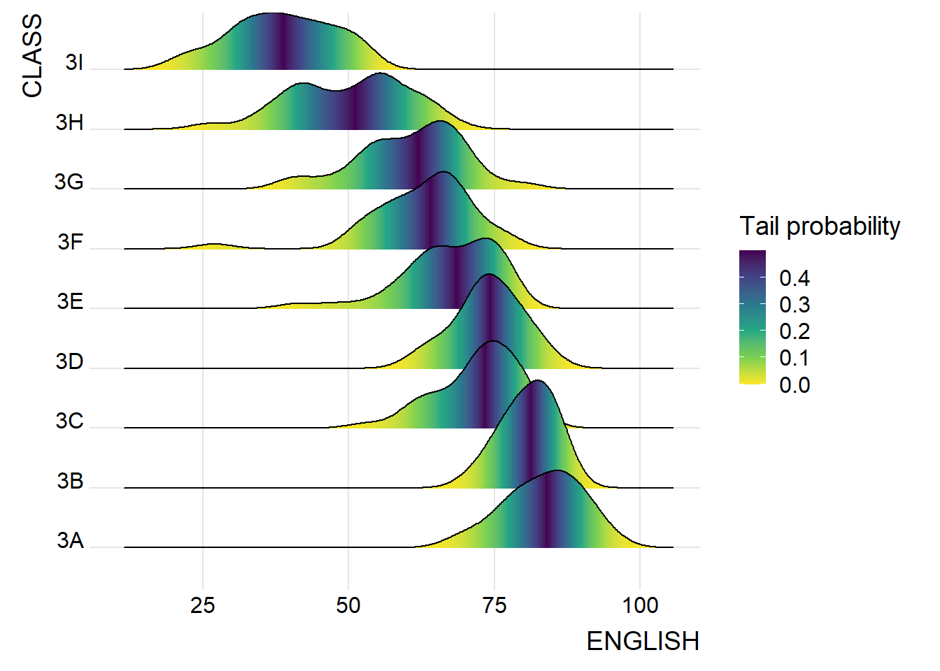
Ridgeline plots with quantile lines
By using geom_density_ridges_gradient(), we can colour the ridgeline plot by quantile, via the calculated stat(quantile) aesthetic as shown in the figure below.
ggplot(exam_df,
       aes(x = ENGLISH,
           y = CLASS,
           fill = factor(stat(quantile))
           )) +
  stat_density_ridges(
    geom = "density_ridges_gradient",
    calc_ecdf = TRUE,
    quantiles = 4,
    quantile_lines = TRUE) +
  scale_fill_viridis_d(name = "Quartiles") +
  theme_ridges()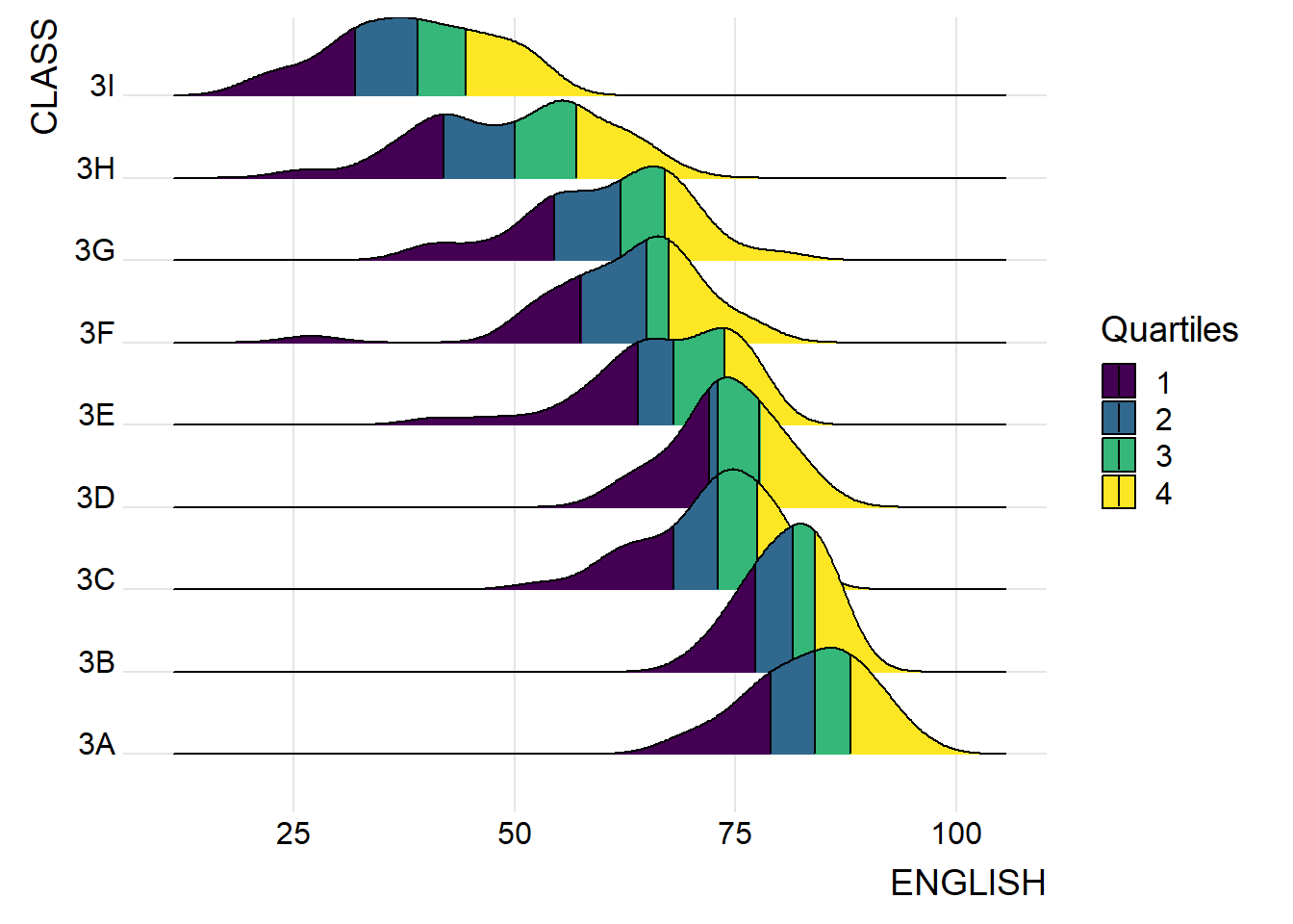
Instead of using number to define the quantiles, we can also specify quantiles by cut points such as 2.5% and 97.5% tails to colour the ridgeline plot as shown in the figure below.
ggplot(exam_df,
       aes(x = ENGLISH,
           y = CLASS,
           fill = factor(stat(quantile))
           )) +
  stat_density_ridges(
    geom = "density_ridges_gradient",
    calc_ecdf = TRUE,
    quantiles = c(0.025, 0.975)
    ) +
  scale_fill_manual(
    name = "Probability",
    values = c("#FF0000A0", "#A0A0A0A0", "#0000FFA0"),
    labels = c("(0, 0.025]", "(0.025, 0.975]", "(0.975, 1]")
  ) +
  theme_ridges()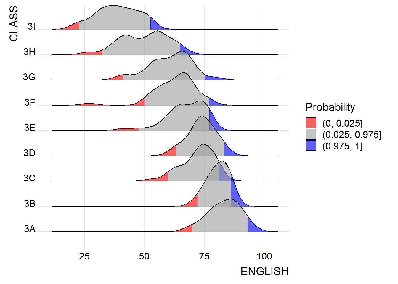
Visualising Distribution with Raincloud Plot
Raincloud Plot is a data visualisation techniques that produces a half-density to a distribution plot. It gets the name because the density plot is in the shape of a “raincloud”. The raincloud (half-density) plot enhances the traditional box-plot by highlighting multiple modalities (an indicator that groups may exist). The boxplot does not show where densities are clustered, but the raincloud plot does!
In this section, you will learn how to create a raincloud plot to visualise the distribution of English score by race. It will be created by using functions provided by ggdist and ggplot2 packages.
Plotting a Half Eye graph
First, we will plot a Half-Eye graph by using stat_halfeye() of ggdist package.
This produces a Half Eye visualization, which is contains a half-density and a slab-interval.
ggplot(exam_df,
       aes(x = RACE,
           y = ENGLISH)) +
  stat_halfeye(adjust = 0.5,
               justification = -0.2,
               .width = 0,
               point_colour = NA)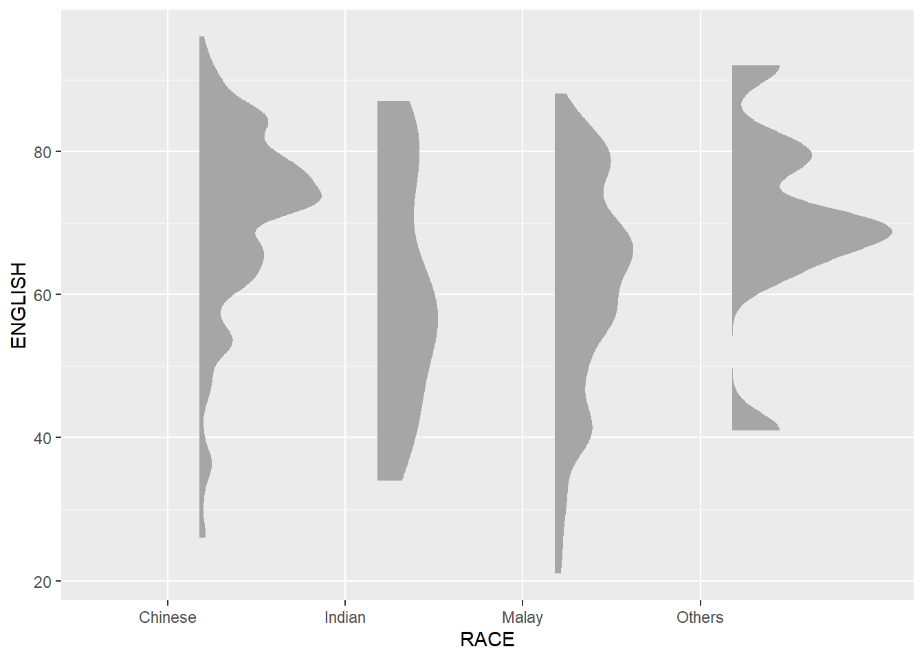
9.4.2 Adding the boxplot with geom_boxplot()
Next, we will add the second geometry layer using geom_boxplot() of ggplot2. This produces a narrow boxplot. We reduce the width and adjust the opacity.
ggplot(exam_df,
       aes(x = RACE,
           y = ENGLISH)) +
  stat_halfeye(adjust = 0.5,
               justification = -0.2,
               .width = 0,
               point_colour = NA) +
  geom_boxplot(width = .20,
               outlier.shape = NA)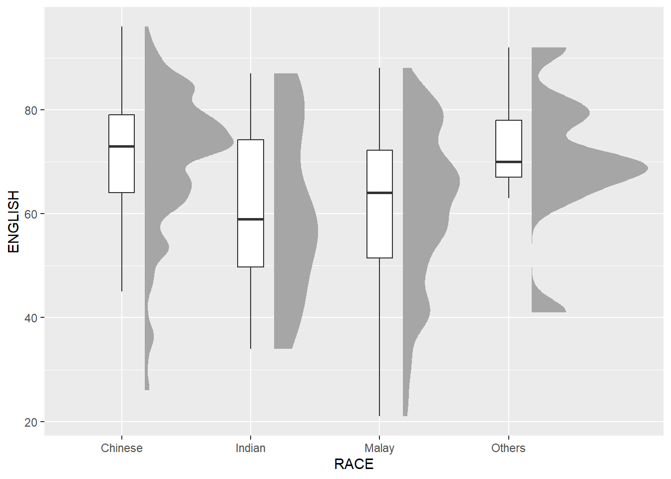
Adding the Dot Plots with stat_dots()
Next, we will add the third geometry layer using stat_dots() of ggdist package. This produces a half-dotplot, which is similar to a histogram that indicates the number of samples (number of dots) in each bin. We select side = “left” to indicate we want it on the left-hand side.
ggplot(exam_df,
       aes(x = RACE,
           y = ENGLISH)) +
  stat_halfeye(adjust = 0.5,
               justification = -0.2,
               .width = 0,
               point_colour = NA) +
  geom_boxplot(width = .20,
               outlier.shape = NA) +
  stat_dots(side = "left",
            justification = 1.2,
            binwidth = .5,
            dotsize = 2)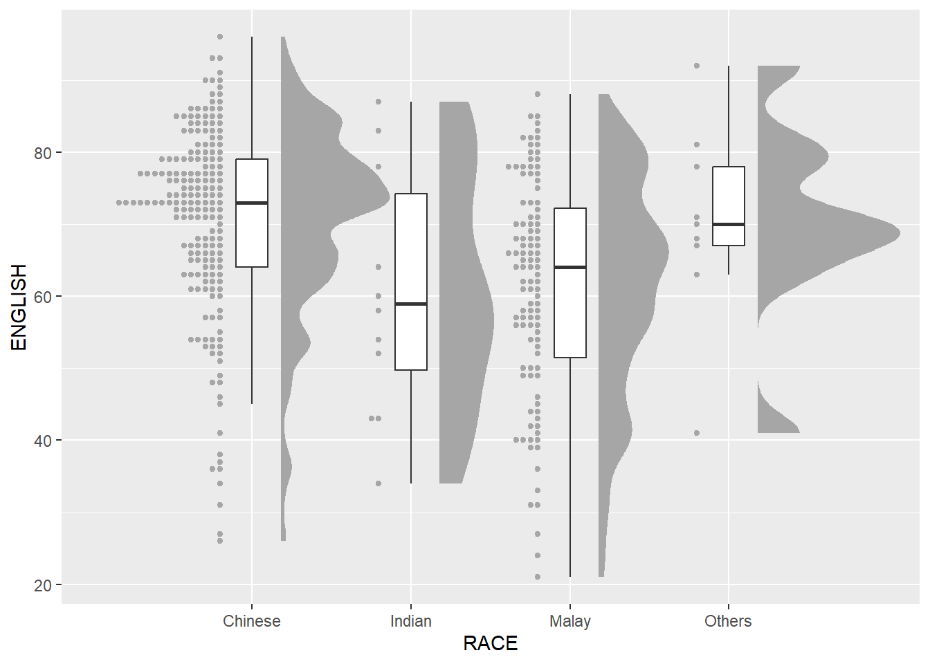
Finishing touch
Lastly, coord_flip() of ggplot2 package will be used to flip the raincloud chart horizontally to give it the raincloud appearance. At the same time, theme_economist() of ggthemes package is used to give the raincloud chart a professional publishing standard look.
ggplot(exam_df,
       aes(x = RACE,
           y = ENGLISH)) +
  stat_halfeye(adjust = 0.5,
               justification = -0.2,
               .width = 0,
               point_colour = NA) +
  geom_boxplot(width = .20,
               outlier.shape = NA) +
  stat_dots(side = "left",
            justification = 1.2,
            binwidth = .5,
            dotsize = 1.5) +
  coord_flip() +
  theme_economist()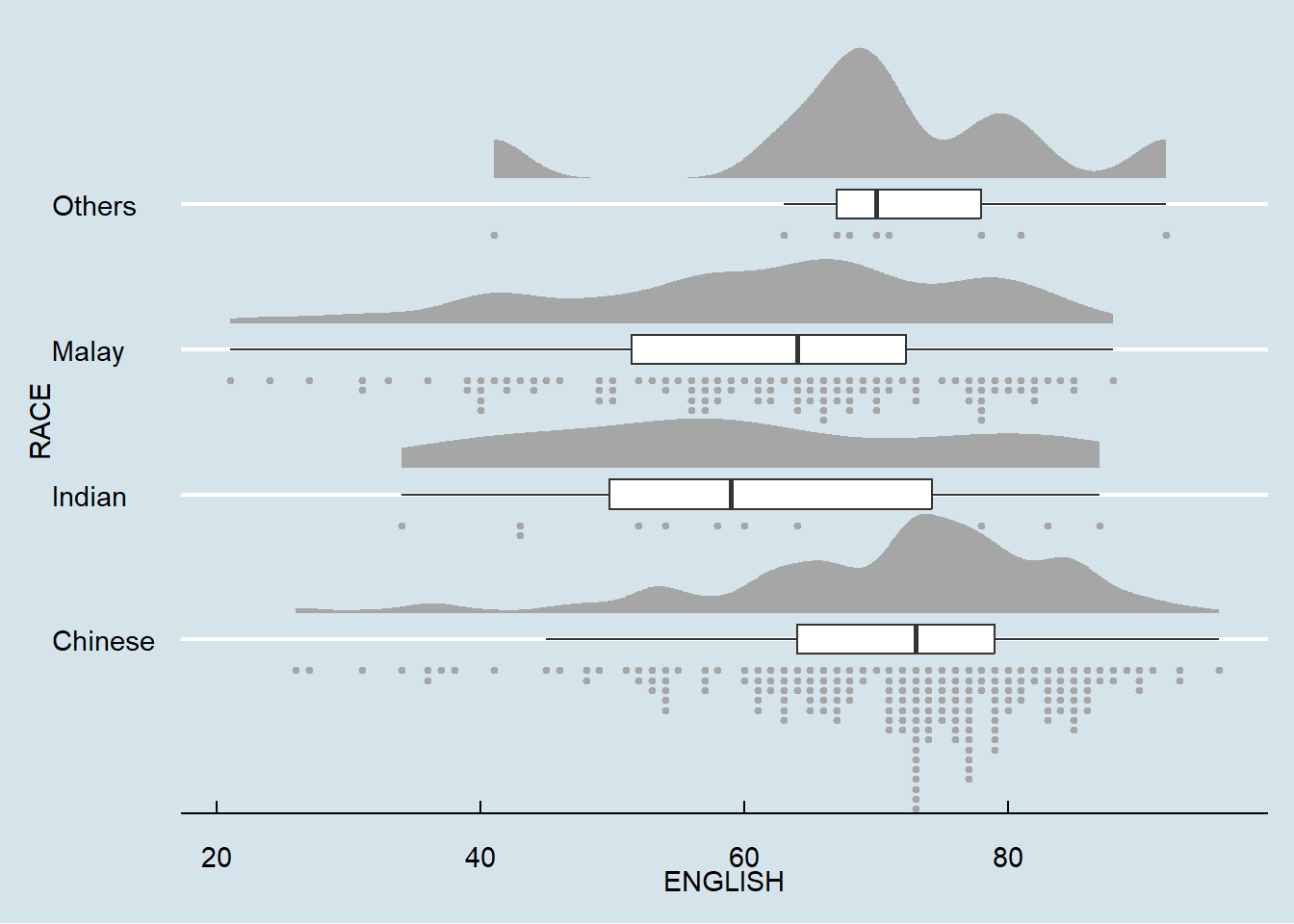
Reference
Claus O. Wilke Fundamentals of Data Visualization especially Chapter 6, 7, 8, 9 and 10.
Allen M, Poggiali D, Whitaker K et al. “Raincloud plots: a multi-platform tool for robust data. visualization” [version 2; peer review: 2 approved]. Welcome Open Res 2021, pp. 4:63.